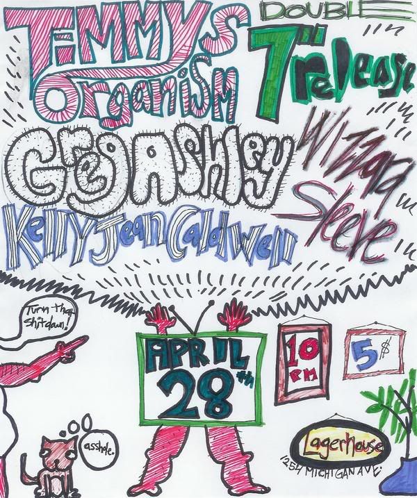
Tonight - Lager House - Timmy's Organism 7" Release / Greg Ashley / Wizzard Sleeve / Kelly Jean Caldwell
Next... we'll get to the shows that don't have any posters...at least none that the internet/glowing box genie/google-demon will reveal to me...

5 / 2 - The Electric Lions (pictured)/ Jesus Chainsaw Massacre / Murdery Mystery - at Izzy's Raw Art Gallery. Should be noisy and weird...hard rolling grooves and some potentially offensive and humorous shouting in a unique venue just down Michigan Avenue near Corktown.

Then, also 5 / 2 - at the Belmont - ThesePeople Comedy (local sketch comedy crew, pictured) are releasing a DVD... "Best Of Vol. 1" and will provide in-between-band comedy performances throughout a set that features Elle & The Fonts, Lightning Love and Millions of Brazilians. Dig it.
Okay..., everyone else has nice fancy posters - so I'll let them do the talking and we can just marvel at this hopefully-not-yet-forgotten-art-form...
(in descending order)
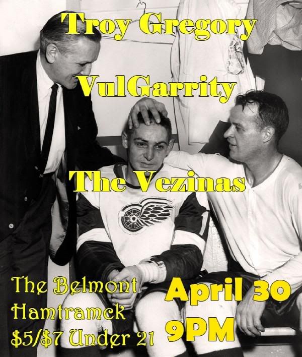
Troy Gregory / VulGarity / The Vezinas - 4 / 30 - Belmont
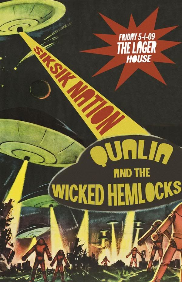
Sik-Sik Nation / Qualia / Wicked Hemlocks - 5 / 1 - PJ's Lager House
Troy Gregory / VulGarity / The Vezinas - 4 / 30 - Belmont
Sik-Sik Nation / Qualia / Wicked Hemlocks - 5 / 1 - PJ's Lager House
Hell City Rock/Fashion & Art show with designer Angela McBride - 5 / 1 - Small's
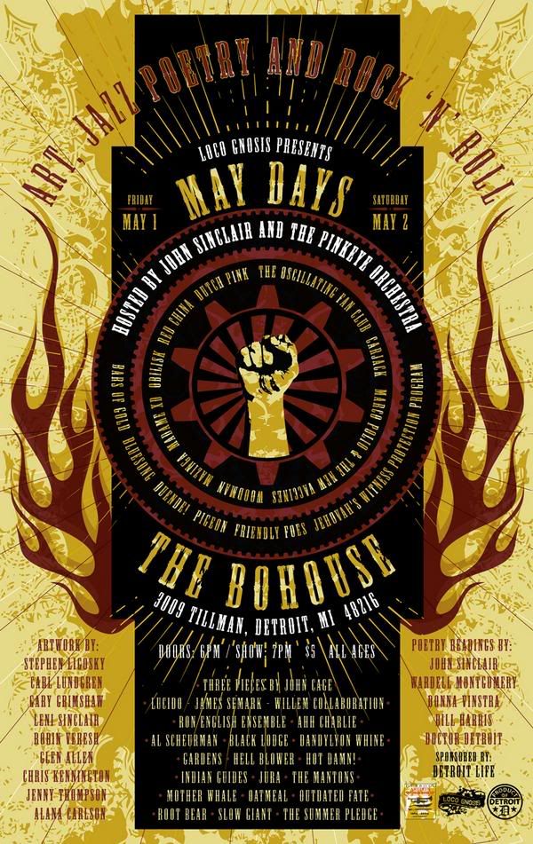
May Days at the Bo-House - Pinkeye / Carjack / Oscillating Fan Club / Duende / Marco Polio & The New Vaccines / Friendly Foes / Red China / Gardens / James Semark / Detroit Artist Workshop / and more more more 5 / 1 - 5 / 2 - BoHouse
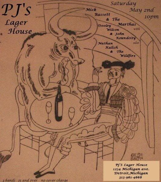
Mick Bassett & The Marthas / Divine Comedians / Dooley Wilson / The Wildfire - 5 / 2 - PJs Lager House
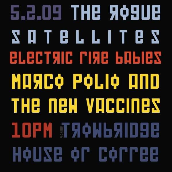
The Rogue Satellites / Electric Fire Babies / Marco Polio & The New Vaccines - 5 / 2 - Trowbridge House of Coffee
~
~
and..., also - at the Berkley Front - 5 / 2 - Desolation Angels / Darling Imperail / Trick 9

![Deep Cutz - [[Uncutz]]](https://blogger.googleusercontent.com/img/b/R29vZ2xl/AVvXsEj56Cy6ejCrNHSD2kFvaVuF4KxeWxvSzDiAy8Qkrjg0RD74ZVaNFczlCm7F-YxRrwevxWXonBDJFBi03G1Lr_jbFWSpu9WS1jhuzgiuZizcLgWLBkIq26ZR6OqJJIfRrDw3YzWw3opFkgs/s730/Deep_Cutz-HEADER.jpg)

1 comment:
The Devious poster has an interesting font—reminds me of something a little scary and a little ’70s-ish. I like the coloring of the last poster, but the font is hard to read with the backwards letters and the “f” that looks like an “r.” If you’re not going to have any images, it’s best to use a font that’s easy to read because most people will be skimming over it, not taking the time to read it a few times when it’s hanging on a wall.
Post a Comment